Illustration Friday,
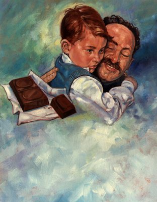
Here is my take on "Safe". This was done for a magazine and it was about a father and his son and chocolate. I didn't say that it was a well written, or even an uplifting piece but, hey, I was just the illustrator.
The space at the bottom was for the text of the story. I have even used it myself for text backgrounds in things that I have been working on.


10 Comments:
WOOWWWWWWWWWW!!! I wish I had a teacher like you in highschool.. my art teacher was a joke. :(
wow!!! grrreat painting!! i'm your fan.
A wonderful painting; brings the sentiment across beautifully
I like this one. As a father myself, it makes me feel warm and fuzzy. It also makes me miss the days of hugs from my dad, who has been gone for 23 years. So in a way, it's bittersweet. The hallmark of a great piece like this is that it provokes strong emotions on several levels.
OOps, that should have been 13 years...
Gorgeous....
WOW!! Beautiful and warmth!! Lovely piece!
This is such a great work! I posted something similar to my blog...but no chocolate in mine, hehe! :P
i just want to say it again (i'm a freak) that this is amazing... this is my favorite of all.
Thanks Eric for your valuable suggestions.
This is an absolute beauty! And that's our job as illustrators, to make people want to read the crap ;)
Great job!
Post a Comment
<< Home