Sunday, September 17, 2006
Thursday, September 14, 2006
My Holbein self-portrait.
I am using the name Holbein, as in Hans Holbein the Younger, loosely to mean the style of portraiture found in northern Europe that dates from the late 1400s to the mid 1500s.
I had seen other illustrators work where they created this beautiful effect of the piece being from another time. John Rush is an illustrator whose name comes to mind for creating work that is from another time. It was a look that I wanted to explore so I set myself the task of creating a self portrait in this style.
The first thing, and one of the most enjoyable parts, is to do some research. One of the interesting things that I found when I looked at drawings from that time is that the proportions are wrong. In the faces specifically. If you go by the standard that the eyes are half way on the head, then these drawings, and paintings are just wrong. (See sample below...as you can see this guy is missing some cranium)
And maybe it is this "mistake" that gives the art it's unique look.
I feel a little out of my element saying that a guy like Holbein, who did the painting below, doesn't know his basic human proprtions but when you study the painting you find that it is true.

I then went to a costume rental place in downtown Toronto and rented what I thought was the clothes that looked like the ones in the paintings.
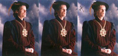
It is very handy to have friends that are photographers and they can shoot some great reference for you for the price of good pasta lunch. These are the some of the shots that I had taken.

The one with the X is the one that I chose as the one that I was going to use for my main reference. I was happy with the way that they turned out. (Aside from the goof in the picture, I thought that they looked pretty good.)
The background is the one that the photographer picked to use for a backdrop. That wasn't my choice.
My next step was to draw it up.
 I made the same "mistakes" in the head proportions that I had noticed in the Holbein work again to try and give it that feel of being from another time. I made a few notes to myself on the drawing about colour ideas, temperature of light etc. I didn't feel the need to render the whole thing at this point.
 And here is the final piece.
As you can see I have made some colour changes from the reference pics but then the photos are a starting point. You shouldn't be a slave to your reference.
I applied washes of burnt umber to give a patina of an old painting. After some of the washes I would come back in and paint in some parts of the painting, doing a push and pull thing with it, to bring some parts forward and push some back.
The scene in the background through the curtain is from the highlands in Scotland.
And lastly as a way of making it appear old, I added cracks and scratches to the surface of the canvas. Some of these I painted with a brush others I actually sratched with a knife.

I am using the name Holbein, as in Hans Holbein the Younger, loosely to mean the style of portraiture found in northern Europe that dates from the late 1400s to the mid 1500s.
I had seen other illustrators work where they created this beautiful effect of the piece being from another time. John Rush is an illustrator whose name comes to mind for creating work that is from another time. It was a look that I wanted to explore so I set myself the task of creating a self portrait in this style.
The first thing, and one of the most enjoyable parts, is to do some research. One of the interesting things that I found when I looked at drawings from that time is that the proportions are wrong. In the faces specifically. If you go by the standard that the eyes are half way on the head, then these drawings, and paintings are just wrong. (See sample below...as you can see this guy is missing some cranium)
And maybe it is this "mistake" that gives the art it's unique look.
I feel a little out of my element saying that a guy like Holbein, who did the painting below, doesn't know his basic human proprtions but when you study the painting you find that it is true.

I then went to a costume rental place in downtown Toronto and rented what I thought was the clothes that looked like the ones in the paintings.
It is very handy to have friends that are photographers and they can shoot some great reference for you for the price of good pasta lunch. These are the some of the shots that I had taken.

The one with the X is the one that I chose as the one that I was going to use for my main reference. I was happy with the way that they turned out. (Aside from the goof in the picture, I thought that they looked pretty good.)
The background is the one that the photographer picked to use for a backdrop. That wasn't my choice.
My next step was to draw it up.
 I made the same "mistakes" in the head proportions that I had noticed in the Holbein work again to try and give it that feel of being from another time. I made a few notes to myself on the drawing about colour ideas, temperature of light etc. I didn't feel the need to render the whole thing at this point.
 And here is the final piece.
As you can see I have made some colour changes from the reference pics but then the photos are a starting point. You shouldn't be a slave to your reference.
I applied washes of burnt umber to give a patina of an old painting. After some of the washes I would come back in and paint in some parts of the painting, doing a push and pull thing with it, to bring some parts forward and push some back.
The scene in the background through the curtain is from the highlands in Scotland.
And lastly as a way of making it appear old, I added cracks and scratches to the surface of the canvas. Some of these I painted with a brush others I actually sratched with a knife.

Sunday, September 10, 2006
Sunday, September 03, 2006
Illustration Friday,
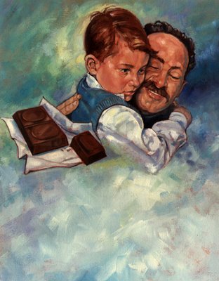
Here is my take on "Safe". This was done for a magazine and it was about a father and his son and chocolate. I didn't say that it was a well written, or even an uplifting piece but, hey, I was just the illustrator.
The space at the bottom was for the text of the story. I have even used it myself for text backgrounds in things that I have been working on.


