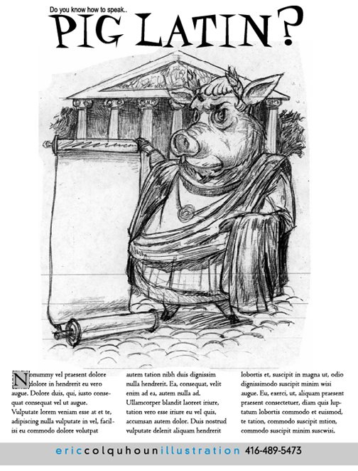
What the heck is Pig Latin?

My current promotion is “What the heck is Pig Latin”. Here is a behind the scenes look at how I did this piece and how I like to work.
The first step is to draw. As illustrators that is, I think, what we should be able to do best; Draw. Bread and butter skills.
I remember going into an art director’s office once and he had this beautiful figure drawing framed on the wall. I commented on the drawing, something like “Love the drawing!”, and then he told me that it was one that he had done. Gulp…no pressure here, I thought to myself. This guy can really draw!
If you are going to be going into business as an illustrator then you need to have some basic skills. (Like being able to draw better then “ok”) If you are, say, a plumber and you can’t weld two pieces of pipe together then you aren’t going to be a very successful plumber. And you won’t be in business for very long. The same thing applies for artists.
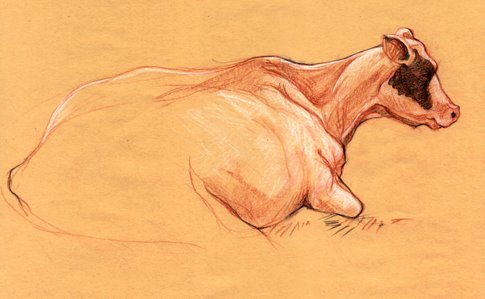
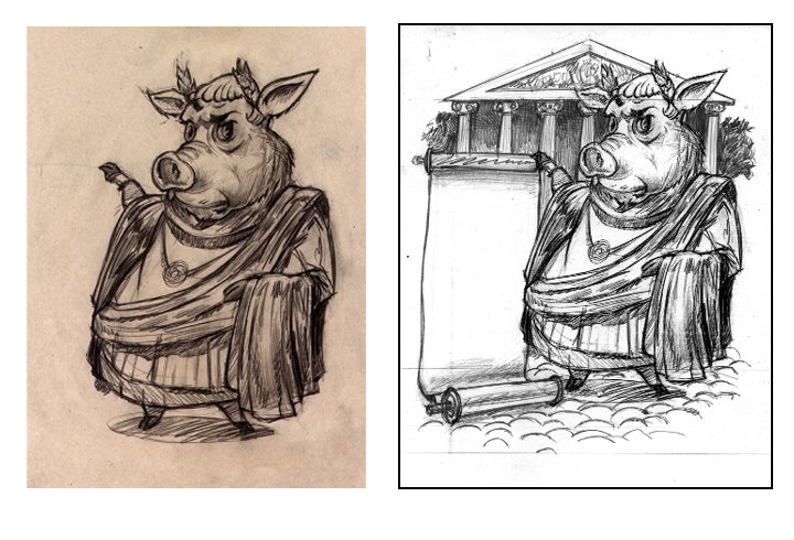
So the drawing for the pig came about as I was trying to come up with a look for this guy. I had the basic idea and then it was a case of trying to get the look right.
After I had a look down I photocopied the drawing and then put in the background. It is not a specific place but is based on a number of pictures of ancient Roman buildings

The next step was to place the type and start making it fit. I hadn’t written the text but I had an idea of how much I wanted for design purposes. (Writing to fit the space)
I played with a number of fonts for the headline, nothing too crazy. I looked at the back issues that I have of Ranger Rick magazine and tried to make it look like something that you might see in there. (My target for this promo)
I left the block with my name in grey for the rough with the thought that I would pick up a colour from the illustration to use for there when I finished. At this stage I hadn’t started the final art yet.
At this point I realized that the scroll should probably be a little bit wider to accommodate the lettering that would be going there. I also decided that the building should be a lower on the horizon should that the pig is more prominent.
At this stage it was still called "Do you know how to speak Pig Latin?"
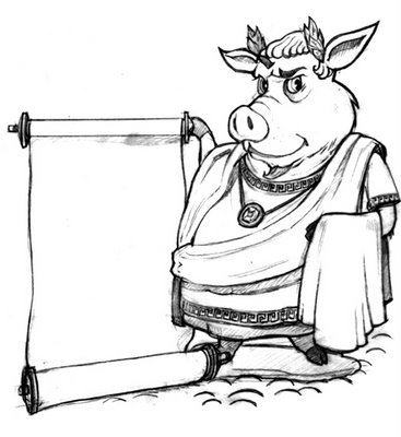
So next it was time to start the tight linear of my pig. I re-drew it on tracing paper and this is where I had to make some decisions about his clothing, details on the clothing etc. It is a real pain to be doing it in Illustrator and then there is some detail that you haven’t fully resolved.
I changed his expression after a friend commented that he looked too “severe” in the first version. So I softened him a little bit.
I scanned it and used as a placed layer/template in Illustrator and started the final art.
Some of the things like his hair colour, I had already made up my mind about, but some of it would have to wait to see how it went with, or played off of the other parts in the final art.
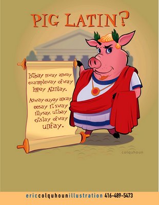
I remember reading an interview with Russell Benfanti, whose work I quite like, and he was talking about the way that he works. And one of the things that he does, in particular, that I think is pretty cool is to export Illustrator files in layers to Photoshop and then throw the Photoshop filters at it to give it a little umph.
So I tried it here for the first time. I used the blur filter on the background building to give it more depth and on the shadow beneath him to make it look a little softer.
The text that you see here was done in Illustrator. I prefer to do this kind of text in Illustrator because you can play with the individual letters, the spacing, rotate them etc. I am not sure if this is proper typography but it retains it’s legibility and I think that it looks good.
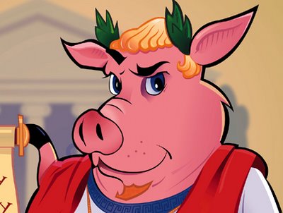
This is a close up of the Emperor’s face.
You can see the depth created by using the Blur filter on the building in the background.
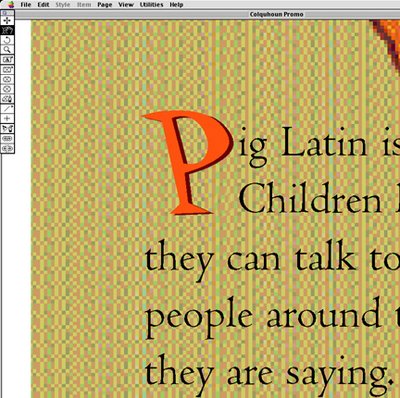
I wrote the text based on the research that I did on Pig Latin. Most of my material came from what I already knew but I also used Wikpedia and The Straight Dope…two excellent sites.
After I got the text to fit the layout the last step was to create the drop cap with the shadow. Actually, it was a scaled cap, not a drop cap. I drew the text box around the cap and then scaled the letter to the size that I wanted. They were both done in Quark.
Off to the printer, get a decent colour match and then stuff some envelopes.